BrushBuddy
Designing an e-commerce experience that earns trust before the first click.
Role
Lead UI/UX Designer ○ Branding Art Director
Duration
8 months
Year
2025
Dr. Polina is a paediatric dentist with an established patient community and an expert in oral health. She wanted to turn her expertise into a business with a curated oral care eComm store for adults, kids, and pets and to build a community to educate on oral hygiene. This project was a full 0→1 engagement: brand identity, UX, design system and dev QA.
Research
7 user interviews, mostly Dr. Polina's existing patients, with 2 pet owners in the mix to cover that segment specifically. A small but focused group: these were people already familiar with her as a professional, so the research priority was understanding purchasing behaviour and friction, not building trust from scratch.
Three findings that shaped everything that followed:
🔎
Fragmented shopping experience
Families were splitting trips across multiple stores: one for the dog, another for the kids, another for adults.
Recently, our vet recommended brushing our family's dog teeth, but it's such a hassle to go to two different stores for toothpaste. I never even considered making brushing a family routine!
🔎
Low category engagement
Getting kids to brush felt like a daily battle. Users wanted products that made it feel like less of a chore.
Brushing teeth is such a drag for my kids. It feels like a constant battle to get them to do it! Making it like a game would be a game changer!
🔎
Trust through expertise
Dr. Polina's name was already enough. The design just needed to make that visible.
If Dr. Polina recommends something, I trust it right away. Having an expert behind a product makes all the difference!
Information Architecture
The research showed a real pattern: families were splitting oral care shopping across multiple stores. It wasn't all under one roof. I structured the site around who the product is for: Adults · Kids · Pets. With needs-based filtering within each segment so a single household could actually shop as one.
Homepage hierarchy
👉 Audience routing first. Users choose their segment before seeing any products.
👉 Expert positioning above the fold, Dr. Polina's role appears in the hero, not the footer.
👉 The Helpers section is a dedicated module for products that make brushing fun for kids. Named for the outcome, not the category.
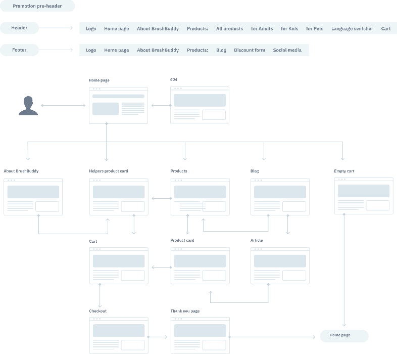
Primary purchase flow, homepage to post-checkout

Site architecture organized by user
Wireframing & Testing

Dashboard prototyping exploration.
Brand Identity
Branding was half of the total scope: positioning, persona, voice, visual system, illustrations pack; developed with a copywriter/illustrator/graphic designer.
BrushBuddy unifies products from more than 10 different manufacturer brands, each with its own visual identity. The system had to hold all of them together without competing with any one of them. The engagement produced a mini brandbook and visual guideline as final deliverables.
The core creative idea repositions BrushBuddy as a buddy - a friendly dentist or vet you can ask anything without feeling embarrassed. That persona carries through a distinct tone of voice: light and tactful humour, no false familiarity or unexplained vocabulary.

BrushBuddy logo.
Visual identity system
✔️ Colour. With 10+ brands already fighting for attention on every page, BrushBuddy's own colour needed to do less, not more. I kept it to neutrals with restrained accents, extended into green/coral/blue for kids, pets, and adults (functional sorting logic).
✔️ Typography. Once colour stepped back, personality had to live somewhere else, so font carries it. I used a warm, slightly playful headline font for the brand's voice, paired with a clean, quiet font for anything functional, so warmth and usability never compete on the same line.
✔️ Iconography. In a category where trust is won or lost on small details, a mismatched icon set is the kind of thing users feel before they can name it. Every icon was drawn to match the brand rather than borrowed from a library.


✔️ The same system extends beyond the screen: hand-drawn stickers and a product-illustration pattern carry the brand's warmth into packaging and social; a structured content plan (highlights, promotions, reviews, ambassador posts) turns the voice guidelines into something the team actually produces week to week; and the unboxing itself — patterned tissue paper, a handwritten note — makes the first physical touchpoint feel like the same brand.

Design System & UI
A full design system in Figma was created with a variable components library, spacing, typography, colours and interaction states.
Key UI decisions
✔️ The Helpers section. A homepage module for products that make brushing fun for kids — named for the outcome, not the category. Came directly from research.
✔️ Dr. Polina on the PDP. Her recommendation sits at the point of decision, not on a marketing page. Structural, not decorative.
✔️ Filter system. Rebuilt after testing — organised by who the product is for, with progressive narrowing by age and specific need.
✔️ Mobile-first. Designed for mobile from the start, with specific attention to filter UX and card layout on small screens.

Design system
Homepage hero section
404 page.
Empty cart page.

Page About BrushBuddy
Handoff & QA
I stayed involved through the build — reviewing developer work against the design system, flagging inconsistencies, and running iterative QA rounds on spacing, interaction states, and responsive behaviour. After lengthy rounds of work with the developer, I ensured that the end result matched the Figma files I had created for the project.
Outcome
BrushBuddy launched as a coherent brand and end-to-end shopping experience, not a template with a logo applied to it. The theme of trust and trustworthiness for her brand was present through the entire deliverable: in the architecture, the product pages, and the brand voice.
🎉
View more projects



🧶